Color Is Back | How to Slide the Scale from Blah to Ta-Dah

Color can be the cure for all manner of life’s blahs, no doubt. While pre-pandemic life gave rise to a minimalistic retreat from the clutter and noise of a busy life, the pandemic timeframe offered the opportunity to look within, both metaphorically and literally. In doing so, many have discovered a re-ordering of priorities. This can show up in a new habit as simple as learning to say no to what doesn’t bring joy and yes to what does.
 During a previous time in your life, you may have relied on minimalism as a remedy for sensory overload in other areas of life. Yet with rejuvenation and a renewed sense of mental and emotional space, you just might be ready to invite a little bit (or a lot) of color in. The tips included in this article will help you slide the scale from blah to tadah, as you infuse your little corner of the world with colors that make you feel alive.
Accessorize
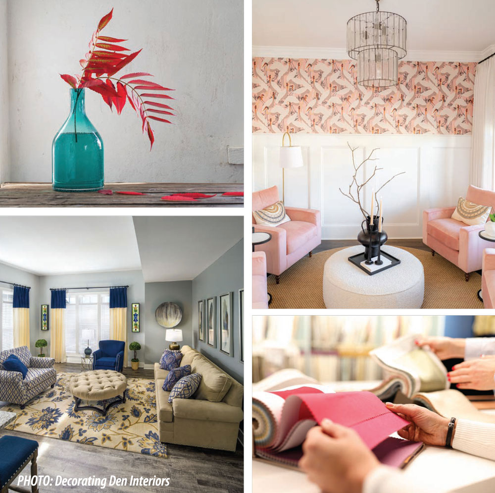
As fast as the length of a shopping haul, you can bring new knickknacks and textiles into your space in the form of pillows and throws, window treatments, rugs, vases, and the like. It’s a quick and low effort change, and boy does it make a difference! Not to mention, it’s flat out fun to select colors and choose from a buffet of options at your favorite local and online stores.
Create cohesion
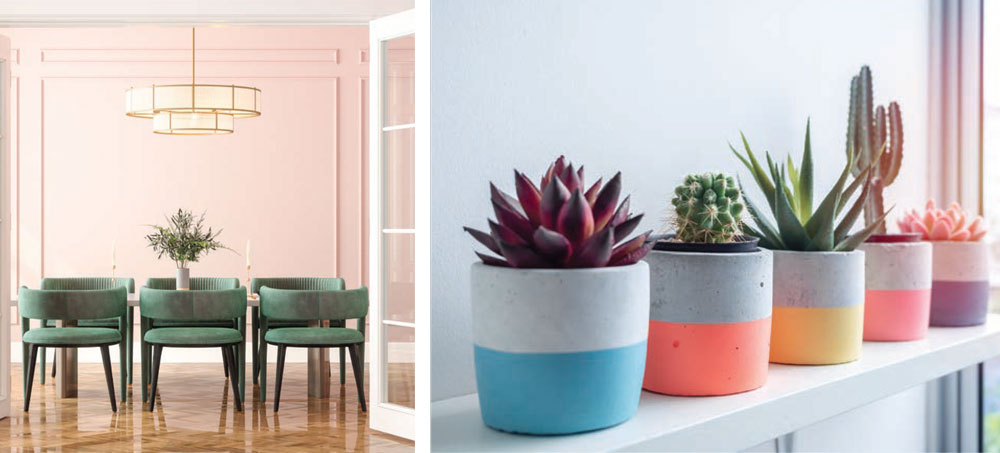
Using your initial neutral color as the main foundation, scatter other favorite colors all throughout the room. This tells the eye that the hues are working together to create a unified tapestry. The traditional 60-30-10 rule in the world of design, stipulates that a dominant color should take up 60 percent of the room, while two complementary colors take up the remaining 30 percent and 10 percent.
The traditional 60-30-10 rule in the world of design, stipulates that a dominant color should take up 60 percent of the room, while two complementary colors take up the remaining 30 percent and 10 percent.
And while you can’t go wrong with this strategy, today’s trends that embrace maximalism, eclectic vibes, and hybrid styles, make way for even more color — imagine four or five — with color blocking offering multiple shade variations in each category.
 Curate
Add character with strategic placement and promotion of special features. Group knickknacks in odd numbers (threes and fives, for instance) for a less staged, more inviting feel. To update the old school accent wall, colorfully highlight specific areas with new adornments like picture frame molding or chair rails. Accent colors can be introduced with painted ambiance elements like fireplaces, credenzas, cupboards, or walls that offer a backdrop to entertainment areas and media — i.e., large-scale works of art, big screen TVs, record players, pool tables, video game consoles or wet bars.
This wouldn’t be an article about color if we didn’t cover wallpaper. If wallpapering an entire room or wall is too much too soon, consider adding patterned colors to a small surface area like the inside of a bookshelf, the top of a plant stand, or the front of the steps. Roller patterned and textured paint can achieve a similar look. Then again, if you do want to take the full plunge from minimalism to maximalism and wallpaper the entire wall, room, or house, who are we to stop you? It’s your house. Go for it!
Like a new haircut after a breakup, your home can reflect your personal transformation. In every spiritual practice, the act of surrender is pivotal to enlightenment. If your space remains static, it can quickly feel stagnant. Allow your abode to reflect your lessons learned, energy shifts, and transformations in an ongoing metamorphosis as your life evolves.
The possibilities are endless, but here are three examples for inspiration for room reinvention as you move that neutral needle to life in vivid color.
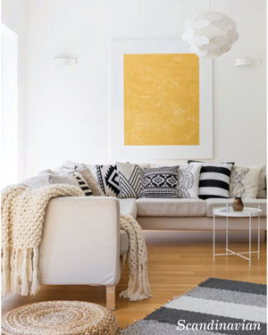 Scandinavian Sense
Infusion If you’re still loving your Scandinavian-inspired simplicity from the Ikea shopping spree of yesteryear, no need to ditch that picturesque oat-colored sectional with the sturdy wooden base. Simply toss in a thick, fluffy area rug that lays down the palette of all the new colors you wish to introduce in your upgraded living room and cozy up with some bright textured pillows and throw blankets with fringe. The addition of both color and texture will deepen the dimension and give the room a greater sense of purpose.
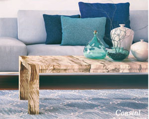 Cohesive Coastal
Hybrid If your sunroom coastal whites, creams, and beiges have you feeling a little too subdued, bringing in a hybrid style might be just the ticket for a fresh breeze to set your sails afloat. A jute rug with some extra colors and fringe or layered with a vintage rug on top can lay a foundation. Then, build upon it with a tasseled table runner featuring colorful geometric shapes and scattered pillows of a different but complementary accent color. Now you have coastal boho vibes. If “granny coastal” is more your cup of tea, introduce floral patterns in table settings and plant holders, along with nautical striped or botanical placemats and cushions. Additional vibrant coastal accessories can include stained glass bottles, lanterns, and sea glass resin art.
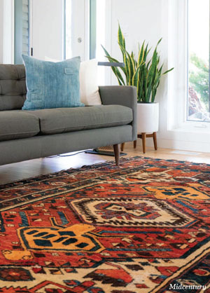 Midcentury Makeover
If your midcentury kitchen is starting to feel a bit too matchy-matchy, you have options galore that will allow you to maintain the same overall design aesthetic. An automatic way to add more color, is to introduce a Moroccan rug with warm tones that appeal to your quirky taste. Change out a few dining chairs for mismatched upholstery and bring in new wood tones like driftwood if you’re feeling beachy or ethereal. Color pops can also show up in the form of a hanging light pendant or barstools in cherry red or canary yellow. ✦
60-30-10 Rule, Accent Colors, Accessorize, Cohesion, Cohesive Coastal, color, Color Blocking, Dominant Color, pillows, rugs, Scandinavian Sense, Strategic Placement, throws, vases, wallpaper, Window Treatments