Classic Favorites and Novel Newbies | What’s Trending in Paint Colors for 2023

What was your favorite color as a kid? Is it the same now? Children typically choose a new favorite color every week, based on their current whims and fancies. Adulthood is really no different. We look to color to inspire our moods, relax our minds and revitalize our souls. Case in point, where we collectively looked last year for rest, we may now look for joy.
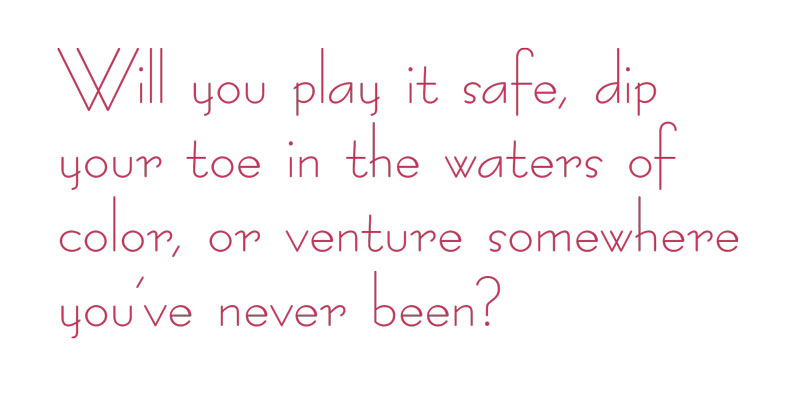
If 2022 encouraged us to embrace serenity and surrender to lessons learned, 2023 urges us to take those lessons and boldly express ourselves with vibrance, authenticity and audacity.
Paint brand forecasts predict a year of blushes and lavenders, earthy reds and soulful jewel tones, along with classic blacks and whites. Neutrals are a staple, as usual, but we now move away from coolness and subtlety, toward more warmth and saturation.
But what about green?
If you jumped on the green train last year, should you now paint over it? We know Kermit the Frog said, “It isn’t easy being green,” but does this mean that green is — gasp — out?!
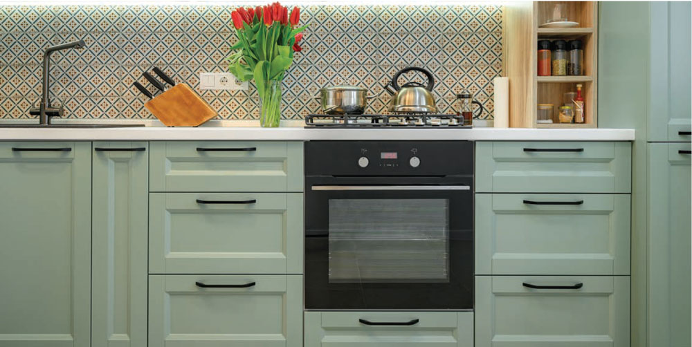
Hardly. Top paint brands still feature plenty of green options in their 2023 palettes. Although green cycles up and down depending on what’s trending, designers seem in agreement, that green has so sufficiently been integrated into home décor, that it can now be considered a mainstay neutral.
However, in terms of what’s hotter than hot, the tides have turned to another nature color that shows up unapologetically and demands our attention, if not admiration. That pigment preference ranges the spectrum of berry red.
Pantone’s Color of the Year
Epitomizing this trend is Pantone’s color of the year, Viva Magenta.
Each year, the Pantone Color Institute rolls out a color of the year, taking into account trends from industries as far and wide as art, music, social media, fashion, interior design, literature and more. Taking a look back, last year’s Very Peri featured red undertones that hinted at the boldness to come. Now Pantone is heating it up even more with a shade intended to introduce a new level of vigor to the world of color.
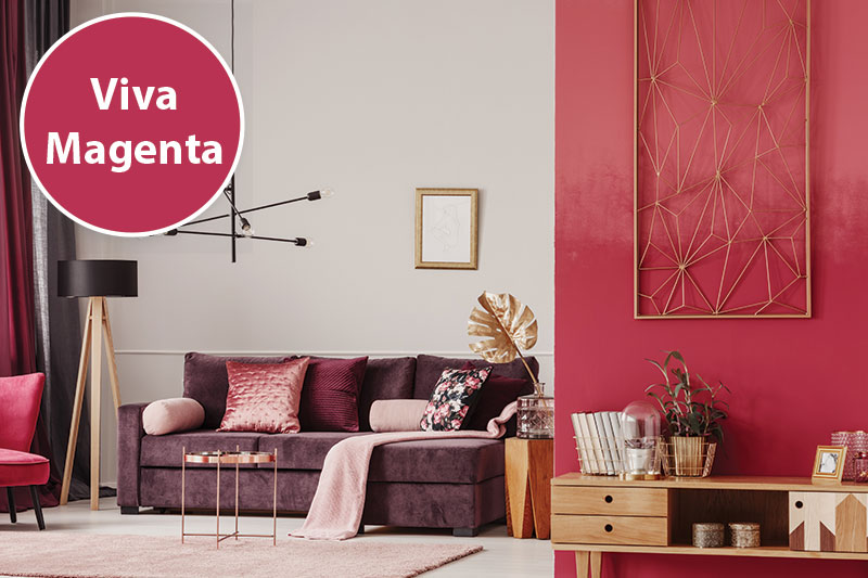
Viva Magenta, a color found in nature, challenges the status quo, showing up with vibrant confidence, rebelling and daringly creating a new statement. This color vibes with picks from other major paint colors across the board. The cottage core décor style was at the forefront of this red undertone trend a couple of years ago, with berry inspired shades and rosy wildflower hues. At the infancy of this trend, it was featured more as an accent color or supportive role here and there. Fast forward to now, and dusty pink, rich lavender and deep rose hues are featured front and center with a red carpet rollout.
Benjamin Moore
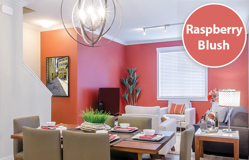
Benjamin Moore jumped on the berry hue bandwagon with their color of the year, Raspberry Blush. With this selection, the idea is to “enliven the senses with an electric optimism.” Quite the contrast from neutrals of the past, the color is celebrated through a partnership with Canadian electro-funk duo Chomeo, who came out with a spirited song by the same name. Raspberry Blush — both the song and the color — “celebrates the positivity and enjoyment of life.”
Other colors in the palette include Conch Shell, Cinnamon, Wenge, Savannah Green, New Age, Starry Night Blue and North Sea Green. While some similar shades like Raspberry Blush, Conch Shell, and Cinnamon could be splashed around together in a monochromatic room, the trending colors are primarily meant to be paired with Benjamin Moore’s complementary neutral picks: Etiquette, White Heron, Gray Owl and Onyx. All in all, Benjamin Moore’s palette this year pushes us to dare to be bright with self-expression, inspiration, creativity and individuality.
Sherwin-Williams
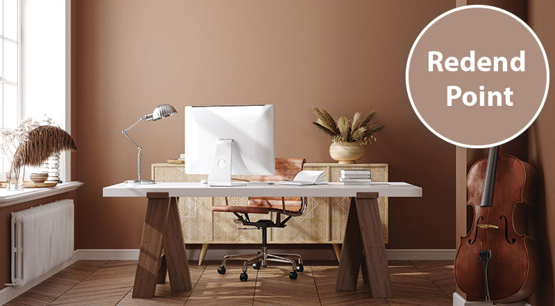
Along similar lines, Sherwin-Williams has selected Redend Point as its color of the year. Reminiscent of clay, this earthy tone can be described as a dusty rose, and this color too, falls into the berry category. Compared to Viva Magenta and Raspberry Blush, however, Redend Point is a more neutral tone with nods to tan and beige. Cabinetry, art and accent knickknacks look stunning in this color, as do walls. It’s neither too bold, nor too soft, so if you want to double up on a trend and neutral combination that doesn’t scream at the senses, this might be a great choice.
Other colors in the palette have a similar feel. Reds, greens and whites are foundational with neutrals like browns and grays mixed in. Sherwin-Williams encourages us to “embrace a spirit of connection with the world around us.” Complementary “warm” and “earthy” hues from the palette include Foothills, Cool Beige, Carnelian, Hushed Auburn, Malted Milk, Pure White, Urbane Bronze and Toile Red.
But not every color of the year is brimming with berry.

PPG Paints
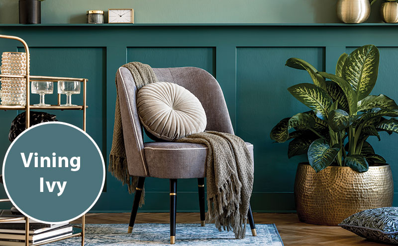
Still riding the green train, PPG Paints named Vining Ivy (a dark teal) as color of the year. Vining Ivy is a bit more saturated and bold than the more muted greens of trends past. PPG’s overall theme is “reflection” with an emphasis on three palettes categorized as “serenity, origin and duality.”
PPG describes the “serenity” palette as consisting of “milky pastels, watery tones and warm neutrals.” The “origin” palette captures “the beauty of the natural world,” with the inclusion of colors of the earth such as Blackberry, Pine Forest, Oceania, Champagne Wishes and Dark Granite. And the “duality” palette features “powerful contrasts between brights, clean pastels and strong neutrals. Colors include Crumb Cookie, Visionary, Oyster Shell, Cloudy State and Starless Sky.
BEHR
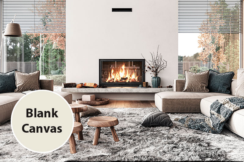
Seemingly playing it the safest, BEHR’s color of the year, is the white shade of Blank Canvas. However, this color is a bit of a paradox. After all, that metaphor of a blank canvas conjures up inspirational thoughts of limitless possibilities. If you have a penchant for Benjamin Moore’s Chantilly Lace, BEHR’s similarly mid-range Blank Canvas is likely to please your eye as well. This fickle shade, smackdab in the middle of cool and warm, is the poster child of paint versatility. This color — if you can call it that — offers a foundational hue that can be paired with virtually any other shade on the color wheel and complement it with sophistication.
BEHR encourages us to “find our center” with subtle colors in the palette that include Half Sea Fog, Perfect Taupe, Spanish Sand, Smokey Pink, Pure Earth, Hybrid, Spiced Mustard, Vermilion, Aubergine, Conifer Green and Sophisticated Teal.
A guide to bolder colors
If you’re boldly moving away from neutrals, but not ready to paint the whole house, try the bright hues first in a bathroom, powder room, mud room or laundry room. Otherwise, these darker and bolder colors can be incorporated as accessories, art and textiles to support an overall style like Boho, Coastal Grandmother, Farmhouse, Maximalism or others. In terms of finishes, designers are depicting more matte textures than anything else.
Any and all colors can be featured as a cohesive backdrop to any room of the house. You’re only limited to the confines of your own imagination, and you make the rules.
Favorite colors come and go in rhythms and seasons. All in all, the 2023 color trends forecast something for everyone, and a coat of paint is one of the easiest changes to make in your home. ✦
blacks and whites. Neutrals, Blank Canvas, blushes, earthy reds, jewel tones, lavenders, Paint Colors for 2023, palettes, Pantone Color Institute, pigment, Raspberry Blush, Redend Point, saturation, Vining Ivy, Viva Magenta, warmth


DO IT YOURSELF | Roanoke Valley HOME Magazine
[…] Repaint your front doorIf you believe the adage about first impressions being lasting ones, then repainting your front door makes great sense. A single quart of exterior latex paint in a bold new color will give the outside of your home a radically updated look. Consult home decorating magazines and paint store employees to learn which colors are trending. (The Early Spring issue of HOME offered all the 2023 Colors of the Year). […]