2020 Vision | The Colors of the Year

The Color of the Year program was launched 20 years ago at The Pantone Color Institute. Since its first choice of Cerulean in 1999, the program’s brand success in trend forecasting and marketing mania each year rockets Pantone’s chosen hue into the star-studded universe of design and decor.
Since then, other paint manufacturers have set off their own colors of the year, reflecting each company’s vision of design trajectories to come, naming a color they feel encapsulates not only where the world is, but where it’s going. Laurie Pressman, vice president of the Pantone Color Institute (PCI), was quoted in a recent interview for Fast Company: “With color and context so intertwined, there really are reasons why a color family or individual color comes into prominence when it does, and for the most part the popularity of a color is symbolic of the age we are living in.”
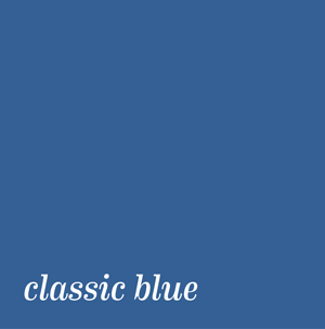 PANTONE announced its 2020 Color of the Year in the first days of December 2019—CLASSIC BLUE—described as a shade reminiscent of the sky at dusk. PCI said the selection was in response to feelings of instability around the world; the shade offers reassurance, confidence and connection in an uncertain global milieu. Classic Blue is “a color that anticipates what’s going to happen next,” says Pressman. “What’s the future going to bring as we move into the evening hours?”
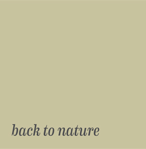 BEHR PROCESS CORPORATION chose nature’s favorite color with its selection of BACK TO NATURE, a muted, grassy shade of green described by the company as a restorative and revitalizing hue that engages the senses. Also concerned with care for the natural world, Behr offers eco-friendly paints; this shade taps into growing concerns of sustainability, the rise of biophilic design and the flourishing indoor plant industry.
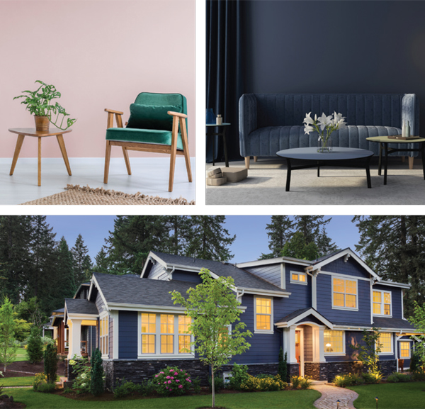
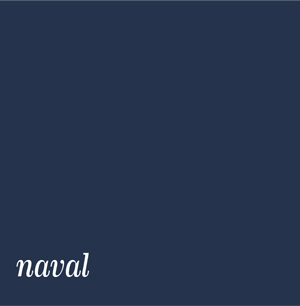
 BENJAMIN MOORE hopes we’ll all lighten up and chose FIRST LIGHT, described as a soft, rosy hue to serve as backdrop for a bright new decade. The company describes its 2020 palette as “delivering modern paint color pairings that combine optimism with understatement.”
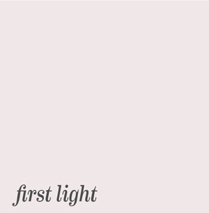
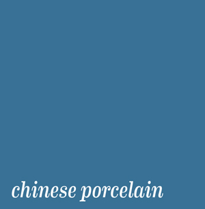
 For its tenth color of the year, SHERWIN WILLIAMS chose NAVAL, a strong and moody shade of navy evocative of the deep blue sea and nighttime sky. Designed to create a calm and grounding environment, Naval throws back to Art Deco opulence and evokes the power of nature. The company also references the biophilic design movement; this shade pairs well with the greens and browns of nature.
 PPG PAINTS chose CHINESE PORCELAIN, a rich jewel tone of blue. The company hopes the shade will inspire mindfulness, hopefulness and rest in a restless world. According to PPG, “Our overarching theme for 2020 reflects the need for ease and fluidity between the digital, physical and emotional parts of our lives.”✦
BACK TO NATURE, BEHR PROCESS CORPORATION, Benjamin Moore, CHINESE PORCELAIN, CLASSIC BLUE, Colors of the Year, FIRST LIGHT, NAVAL, PANTONE, PPG PAINTS