Behind the Wheel | Using Color Theory in Design


The great French painter Paul Gauguin late in life wrote, “Color! What a deep and mysterious language, the language of dreams.” Scientists and philosophers have worked for centuries to unlock the mysteries of color. The first known theory of color was Aristotle’s; he believed color to be “Sent by God from Heaven through celestial rays of light” (Smithsonian Libraries). In the early 1600s, Finnish astronomer Aron Sigfried Forsius developed the first diagrams visualizing relationships and mixtures of colors on a spectrum from red, yellow, green and blue to grey—each placed as closer to black or white. Later that century, Richard Waller devised a color matrix of 21 simple colors with examples of mixed pigments.
In the 1660s, a very young Sir Isaac Newton—before he moved into studies of laws of motion, universal gravitation and the shape of the earth—contemplated the composition of color. Shining a beam of light through a prism in a darkened room, Newton found that white light refracted colors of the rainbow: red, orange, yellow, green, blue, indigo and violet. He found the makings of a rainbow; with his connection of violet at one end of his spectrum to red at the other end, the spectrum became a circle, and Newton’s color wheel was born.

A color theory primer
Color theory is the science underlying human perception and interpretation of color. The color wheel is an essential tool for understanding components and combinations of color. Primary colors red, blue and yellow are basic colors which cannot be broken down into simpler colors. Orange, green and purple are secondary colors, created by mixing two primary colors: red and blue yield purple; yellow and red make orange; blue and yellow create green. Intermediate or tertiary colors are created by mixing primary and secondary colors: Yellow-orange, red-orange, red-purple, blue-purple, blue-green, and yellow-green. In general, apply the 60-30-10 rule: one color is dominant and fills 60 percent of the space, often a neutral. The secondary color fills 30 percent, with the accent color rounding out the last 10.
Complementary colors: Red and green, purple and yellow, orange and blue—are directly across from each other on the color wheel; when mixed they cancel each other out and create black.
Cool and warm colors: Used to create mood in a room. Take the temperature of a room: warm colors are reds, oranges and yellows; cool colors are blues, greens and purples.
Neutrals: Beiges, greys, whites and blacks, often used for backgrounds to “ground” more vivid hues.
Tint: Lighting a color by adding white.
Shade: Darkening a color by adding black.
Tone: Lightly darkening a color by adding grey.
Bring order to the whole
The goal for successful design is harmony. A harmonious color scheme is intentional in design and chosen for aesthetic appeal. Five color schemes produce harmony in design.
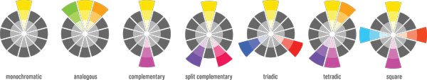
A monochromatic palette is one in which colors are created from tints of the same color, using black to darken or white to lighten. This palette is the simplest of schemes, often used in minimalist design.
An analogous scheme uses three colors next to each other on the color wheel, and delivers a peaceful, sophisticated and soulful vibe. Readily found in nature, analogous examples are autumn palettes of red, orange and yellow, and ocean blues and greens. A “high key” analogous scheme is achieved by adding white to the three colors. High key design is found often found in impressionist art where colors seems to ‘shimmer’ and ‘blur’ into each other, according to the Interaction Design Foundation.
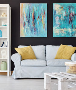
A complementary scheme uses colors directly opposite each other on the color wheel, achieving high impact and energy. It is best to set off complementary colors as secondary against neutral walls and floor, to choose one accent color as predominant, with the other providing splashes of color. To ensure a cohesive look, follow the 60-30-10 rule: 60 percent neutral—walls and floor—30 percent secondary, and 10 percent for the splash. In a kitchen, think all-white walls and counters, with teal blue leather barstools and coral barrel shades done up in linen overhead.
Split-complementary or compound harmony uses the two adjacent colors to the complement: instead of choosing blue and orange, the designer would choose blue and red-orange and yellow-orange. It is best to use a more muted version of the primary color and make bolder choices with accent colors.
Triadic schemes use three colors equidistant on the wheel: violet, orange and green; red, yellow and blue; yellow-orange, blue-green and red-violet. These schemes are bold and often found in children’s spaces; for a more grown-up feel palettes can be tempered by hue and tone.
Tetradic palettes impose an imaginary rectangle anywhere on the color wheel in any direction—two sets of complementary colors: think purple and blue-green plus yellow-green and red. This harmony is dramatic and rich with color, but can also get messy fast. Let one color dominate, and don’t be afraid to ground all that color with neutrals in the background.
Related to the rectangular tetradic scheme, a square scheme incorporates four colors equidistant on the wheel—perhaps purple, red-orange, yellow and teal. Again, be careful and don’t get gaudy! Tread lightly and this time adapt that 60-30-10 rule, splitting the last 10 percent between two colors.
In the mood
Designers who understand the psychology of color theory use it to establish the “mood” of a room. Red evokes power; orange is optimistic. Yellow feels joyous and optimistic, green is restorative and hopeful, blue is peaceful and purple is distinguished and creative. Think about how you want to feel in your kitchen, your office, your bedroom; let the color wheel guide you.
Stephen Sondheim’s glorious musical Sunday in the Park with George opens with the French pointillist George Seurat starting work on the canvas we’ve all seen—A Sunday Afternoon on the Island of La Grande Jatte in 1884: As the great Mandy Patinkin in the role of George sings, “The challenge: bring order to the whole—through design, composition, tension, balance, light and harmony.”
Here’s to harmony at home, and here’s to taking a spin on Isaac Newton’s color wheel. ✦
analogous, Aristotle, Aron Sigfried Forsius, color, Color Theory, Complementary colors, complementary scheme, design, Gauguin, Intermediate colors, Isaac Newton, monochromatic palette, Neutrals, Primary colors, prism, secondary colors, Shade, Split-complementary, tertiary colors, Tetradic, Tint, Tone