Color Your World | What’s Trending In Paint Colors for 2022

What paint trends will tempt your eyeballs and tickle your fancy in the year to come? With nods to nature, nostalgia and coziness, the 2022 color palettes across major paint brands offer a great deal of versatility. Here, we’ve gathered palettes from Behr, Sherwin-Williams, Benjamin Moore and PPG Paints so that you can pick and choose to form a preference palette of your very own. Taking into account trends that are both varied and flexible yet classic, the hues of 2022 can be used in virtually any room of the house.
Last year, tranquility was the name of the game. After the whirlwind of 2020, we yearned for solace on the home front. It came as no surprise that the 2021 palette included nature colors, homey comfort and sunbaked hues to remind us that home is a place of safety and rest. The colors of 2022 extend the mood with some enhanced and additional themes, along with an added nudge of expansive possibility. The palettes this year aren’t a far bridge from last year. Lots of timeless anchoring colors remain, as do the stark linen whites and warm earthy clay tones. Greige (the combination of gray and beige) is still a mainstay and a suggestion that color is never one dimension.
Newer popular palettes now incorporate some fun berry and wildflower hues into the mix, offering up a countryside feel. The “cottage-core” style, which has been on trend for the past couple of years, created a yearning for more of these natural, deep reds. With the emergence of prairie fashion and the resurgence of Venetian textures, like plaster walls and terrazzo flooring, the stage is set for passionate pinks and deep burgundies.
Another notable change is that we now move from yellows to greens as the top trending colors of the year. One of Pantone’s 2021 colors of the year, Illuminating, was a bright and happy yellow. This is quite a bright contrast to the cooler and more earthy sage greens featured across major paint brands for 2022. In terms of color psychology, it’s possible that we need less of a sunny boost this year. Perhaps we are now ready to settle in and roll onward and upward with the punches of life right as it unfolds.
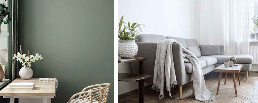
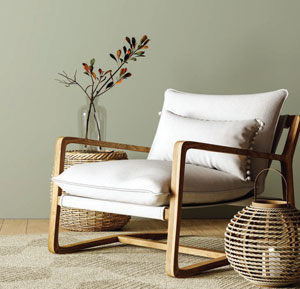 Green, and specifically sage green, is a color that seems to come in and out of vogue. This color, which is associated with tranquility, inspiration, liveliness and grounded well-being, is also thought to make a home more attractive to potential buyers when on the market. This could be because the eye is receptive to calming colors found in nature.
Kermit the Frog famously said, “It isn’t easy being green.” Be that as it may, it certainly is easy in 2022 for the rooms of your house to be green. Even easier is to turn to any of the top paint brands and simply choose a “color of the year.” They’re all—you guessed it—a shade of green. Ranging from warm yellow undertones, to neutral olive, to natureinspired sage and cool mint, looking at this spectrum, you’ll understand that there’s no one-size-fits all for green.
Timeless Whites
Whites and neutrals will always be “in,” and these timeless shades stun to an even greater degree when paired with the trending greens and other top colors of 2022. From smoky cool, to creamy warm, and even dancing on the edge of buttery, whites and neutrals can run the gamut and set the stage for all kinds of moods. Whether opting for boho, coastal, farmhouse, or any other decor, you can’t go wrong with these classic choices. Here are some top favorites of the pros:
Benjamin Moore Chantilly Lace: This hue is about as true white as you can get, with the intensity falling right in the middle between cool and warm. Chantilly Lace is the perfect choice for a living room wall, existing as a stark backdrop to statement pieces and boldly colored furniture.
Sherwin-Williams Snowbound: Perfect for rooms that get quite a bit of traffic and clock a lot of time spent within, this soft and subtle shade is noted for its versatility with light. Whether day or night, artificial or natural, casting from lamps or overhead fixtures, the light source looks stellar against the whiteness of this paint.
Benjamin Moore Swiss Coffee: This warm offwhite is versatile with any aesthetic and pairs with all accent colors and textures. You will never need to change this paint color, as it’s been used since the dawn of the day. When in need of a change, switch up accents and other sources of color like furniture and art. This primary color is a winner and a staple.
Behr Irish Mist: The warm undertones of this light “greige” lets us in on a little secret that color doesn’t always know what it wants to be. Sometimes it flirts with the line between two or more shades, and in doing so, it launches a playfulness that inspires us to use it for whatever wall suits our desire, while pairing it with whatever makes our heart sing.
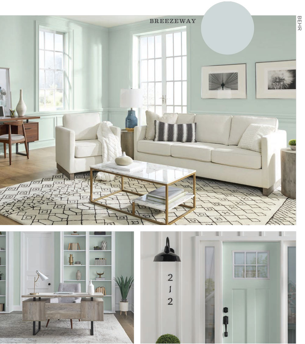
BEHR hopes to inspire you to “embrace a sense of renewal and to explore new hobbies or adventures, both near and far, that excite,” according to their website. BEHR’s color of the year is BREEZEWAY, which is a minty, cool bluish-green color, with an easy-breezy coastal feel that whispers permission to blow with the wind.
Other colors in the palette include: Whisper White, Sunwashed Brick, Nightingale Gray, Perfect Penny, Lingonberry Punch, Studio Clay, Basswood, Wild Mustang, Corn Stalk, Sustainable, Laurel Tree, Wave Top, Explorer Blue, Ocean Abyss, Lunar Surface, After Rain, Dark Cobalt Blue and Cracked Pepper.
With the 2022 palette, inhabitants of the home are encouraged to step into the unknown and move forward. Let’s let go of what no longer serves, lighten the load, and dare to dream of what could be.
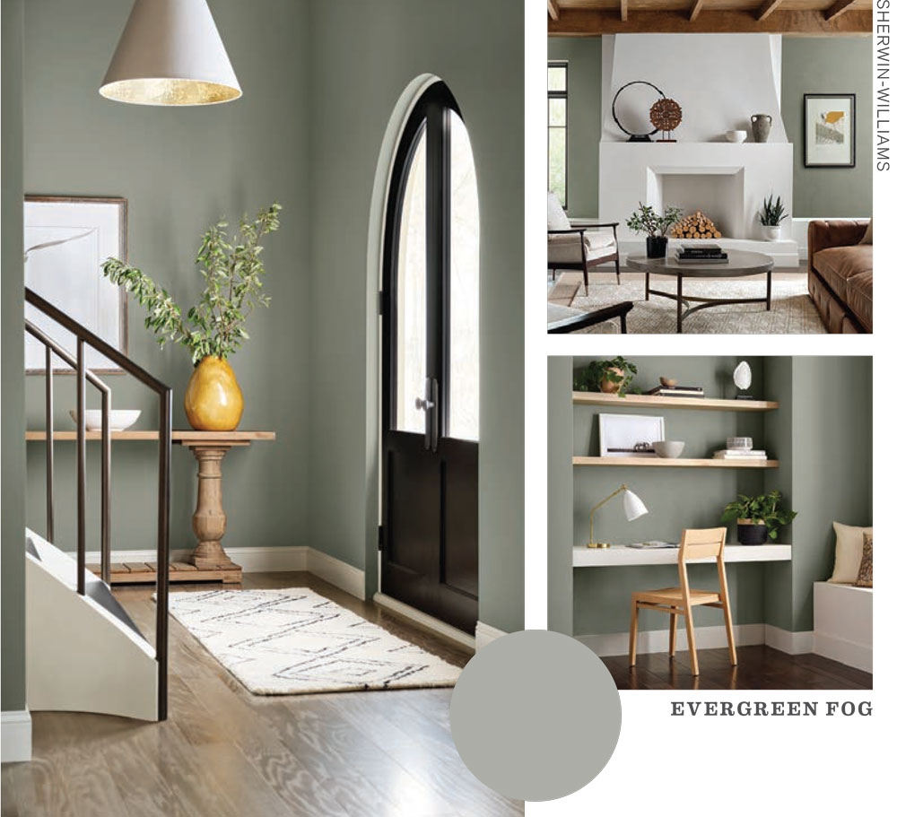
In keeping with the spirit of progress, SHERWIN-WILLIAMS wants to remind us that “nothing is permanent; all is everchanging.” With four separate color palettes, we are urged to embrace novelty and evolution through a creative process that is specific to our lens of the world. EVERGREEN FOG is the Sherwin-Williams choice for color of the year. As part of the Method palette, this shade is imbued with strong gray undertones and a timeless feel. Although technically green, this color is neutral enough that you can paint it on your living room walls, embracing a top trend while still playing it safe.
The Method palette encourages us to embrace a unique process of creation that is personal to us with “organic neutrals.” Other colors in the Method palette include: Accessible Beige, Urbane Bronze, ber Umber, Woven Wicker, Soji White, Chartreuse, Bakelite Gold and Beige.
With the Opus palette, we use our personal creative process to “set the tone for a masterpiece” with bold anchoring colors. The Opus palette includes: Cocoa Whip, Garret Gray, Iron Ore, Aleutian, Coral Clay, Naval, Samovar Silver, Red Bay and Blackberry.
Moving onto the Dreamland palette, we engage in the act of creation—a culmination of flourishing ideas, personified by “pearlescent tones, new-growth greens, and lavish pinks.” The Dreamland palette includes: Rose Tan, Natural Linen, High Reflective White, Rosemary, Felted Wool, Cucuzza Verde, Lite Lavender, Ros and Dynamo.
With the Ephemera palette, we enjoy the fruits of our labor and dabble in playfulness with “pops of color, softened with time,” as we hark back to “vintage charm and vibrant optimism.” The Ephemera palette includes: Alabaster, Pink Shadow, Sierra Redwood, Peace Yellow, Inky Blue, Cascades, Moody Blue, Basque Green and Rejuvenate.
Pantone’s Color of the Year
In December 2021, Pantone revealed the much-anticipated color of the year for 2022: VERY PERI.
Each year, a Pantone Color Institute global team of experts scours the worlds of art, music, fashion, social media imagery, trending interior design texture, and cultural attitudes and moods.
“Newness” and “futuristic” are the buzzwords of 2022, according to the Pantone Institute, and Very Peri honors these values.
As a member of the blue family, but with vibrant red undertones, Very Peri is a polarity in color and symbolic as a “global Zeitgeist of the moment and the transition we’re in,” as we emerge from a period of intense isolation, according to Pantone’s website. It encourages us to reimagine what life could be and rewrite a future as we step into the unknown.
Moving on from the abstract psychology of the color to the concrete specifics of the shade, Very Peri is the epitome of versatility. It combines well with a slew of color palettes and completely changes the mood, depending on its pairings.
Paint your walls in Very Peri in 2022 if you’d like to surrender to the unknown and embrace a landscape of endless possibilities.
BENJAMIN MOORE tells us to “make room for creativity.” While many of the palettes of the other brands offer standalone colors, Benjamin Moore delivers on a palette of choices that are very complementary with one another on the color wheel. Representing a blossoming flower, they can work in tandem to establish continuity throughout the room and even the entire home.
The color of the year, OCTOBER MIST, is a silvery green, reminiscent of the “stem of a flower.” Benjamin Moore hopes that your imagination will bloom as you decide how to incorporate the other flowery tints.
Other colors in the 2022 palette include: Steam, Morning Dew, High Park, Gloucester Sage, Pale Moon, Hint of Violet, Farmwood Green, Quiet Moments, Mysterious, Collector’s Item, Natural Linen, Venetian Portico and Wild Flower.
Creativity here seems to refer to the marriage of imaginative energy and the slow, quiet diligence of nature.
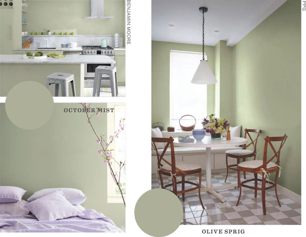
PPG’S offerings “brighten any space with an organic liveliness” and a desire to make you feel soothed and refreshed with colors of the natural world, consisting of three different palettes.
OLIVE SPRIG is the color of the year. In using it, we can tip our hat to nature and remind ourselves of regrowth and resilience in a world that continues to turn round and overcome challenges.
The Invaluable palette, invoking “nostalgia for comfort and reassurance,” also includes: Oyster Shell, Gooseberry, Onyx, Ancient Copper, Vining Ivy, Intrigue, Candlelit Beige, Oceania, Winter’s Breath, Guacamole, Castle Stone, Ancestral and Antiquity.
The Introspective palette, which embodies a “welcoming and warm” vibe, includes: Lotus Petal, Imagine, Carrot Cake, Magic Wand, Pine Whisper, Bunrt Red, Tea Time, Silver Service, Wistful Walk, Peace, Edamame and Yellow Coneflower.
Lastly, the Inspired palette, infused with “optimism and joy,” includes: Paris Pink, Isle Royale, River Rouge, Atrium White, Coral Silk, Cenote, Mirabella, Chilled Mint, Aloha, Calypso Berry, Lettuce Alone and Light Sage.
PPG blends up an alchemical concoction of everything the 2022 psyche needs—positivity for our mindset, joy for our present experiences (flaws and all), a comfortable remembrance of the past, and a bright hope for the future.
Embrace the 2022 colors that fill your home with the aliveness of nature, the passion and raw emotion of humanity, and the unpredictable evolution of this windy path we’re all traversing. ✦
“Cottage-Core” Style, 2022 Color Palettes, Behr, Benjamin Moore, Berry And Wildflower Hues, Breezeway, Collector’s Item, Dreamland Palette, Ephemera Palette, Evergreen Fog, Farmwood Green, Gloucester Sage, greens, High Park, Hint Of Violet, Inspired Palette, Introspective Palette, Invaluable Palette, Method Palette, Morning Dew, Mysterious, Natural Linen, October Mist, Olive Sprig, Opus Palette, Pale Moon, PPG PAINTS, Quiet Moments, Sage Green, Sherwin-Williams, Steam, Venetian Portico, Wild Flower